CONTENT
ここから
この節で学ぶこと
前回の 4-8 では、PageView.builder と % を使って、3本の動画を無限に続いているように見せる仕組みを学びました。
PET
↓
FOOD
↓
ROOM
↓
PET
↓
FOOD
↓
ROOM
今回の 4-9 では、TikTok風アプリの右側に並ぶボタンを作ります。
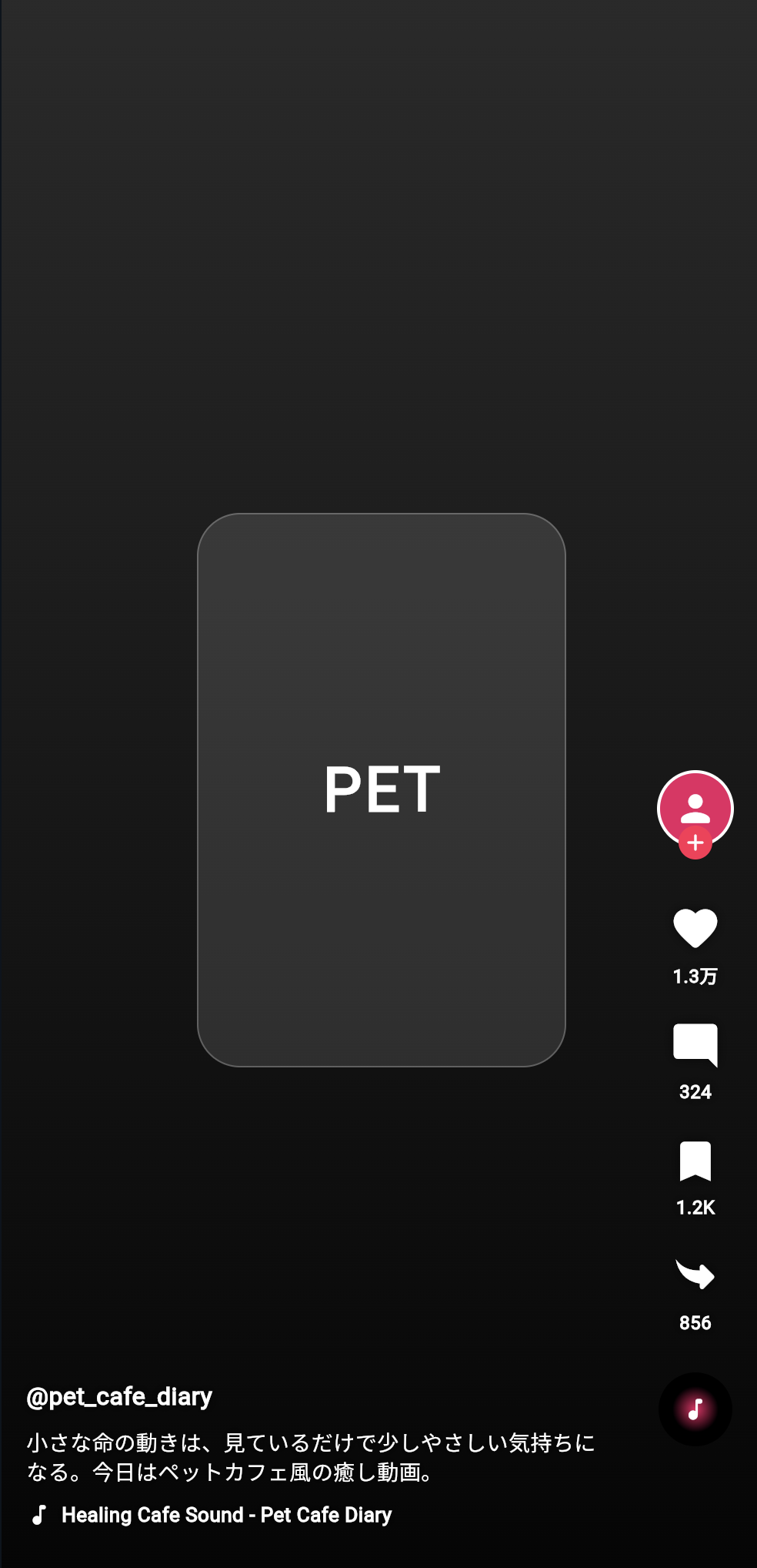
TikTok風の画面では、右側に次のようなボタンが縦に並んでいます。
プロフィール
いいね
コメント
保存
共有
音源ディスク
この部分を、まとめて RightActionBar というWidgetとして作ります。
この節で大切なのは、次の一文です。
同じ形のUIは、Widgetとして部品化すると読みやすく、再利用しやすくなる。
右側アクションバーとは何か
右側アクションバーとは、画面の右側に縦に並んでいる操作ボタンのまとまりです。
今回作るTikTok風アプリでは、次のような構造になります。
RightActionBar
├─ ProfileButton
├─ ActionButton いいね
├─ ActionButton コメント
├─ ActionButton 保存
├─ ActionButton 共有
└─ SpinningDisc
それぞれの役割は、次の通りです。
| 部品 | 役割 |
|---|---|
ProfileButton | 投稿者のプロフィールアイコンとフォローボタン |
ActionButton | いいね・コメント・保存・共有の共通ボタン |
SpinningDisc | 音源を表す丸いディスク |
RightActionBar | 右側の部品を縦にまとめる親Widget |
ここで重要なのは、いいね・コメント・保存・共有は、形がかなり似ていることです。
アイコン
↓
数字やラベル
そのため、1つずつ別々に作るのではなく、ActionButton という共通部品を作ります。
なぜ部品化するのか
もし、右側ボタンをすべて直接書くと、コードが長くなります。
Column(
  children: [
    Icon(Icons.favorite),
    Text('1.3万'),
    Icon(Icons.mode_comment),
    Text('324'),
    Icon(Icons.bookmark),
    Text('1.2K'),
    Icon(Icons.reply),
    Text('856'),
  ],
)
この書き方でも、画面は作れます。
しかし、次のような問題があります。
同じようなコードが何度も出てくる
あとから見たときに読みづらい
ボタンのデザインを変えるときに複数箇所を直す必要がある
そこで、ボタン1つ分を ActionButton として作ります。
ActionButton(
  icon: Icons.favorite_rounded,
  label: '1.3万',
)
この形にすると、コードが読みやすくなります。
ActionButton
├─ icon
└─ label
そして、いいねも、コメントも、保存も、共有も、同じ ActionButton を使えます。
新しい言葉:部品化とは何か
部品化とは、画面の一部分を、意味のあるWidgetとして切り出すことです。
初心者向けには、次のように理解してください。
部品化 = 長い画面コードを、小さな役割ごとのWidgetに分けること
たとえば、右側アクションバーを部品化すると、次のようになります。
画面全体
└─ RightActionBar
   ├─ ProfileButton
   ├─ ActionButton
   ├─ ActionButton
   ├─ ActionButton
   ├─ ActionButton
   └─ SpinningDisc
このようにすると、画面全体の構造が見えやすくなります。
新しい言葉:親Widgetと子Widget
Flutterでは、Widgetの中に別のWidgetを入れることがよくあります。
このとき、外側のWidgetを親Widget、中に入っているWidgetを子Widgetと考えることができます。
たとえば、次のコードを見てください。
Column(
  children: [
    Icon(Icons.favorite),
    Text('1.3万'),
  ],
)
この場合、Column が親Widgetです。
Icon と Text が子Widgetです。
Column 親
├─ Icon 子
└─ Text 子
今回の RightActionBar も、複数の子Widgetを持つ親Widgetです。
RightActionBar 親
├─ ProfileButton 子
├─ ActionButton 子
├─ ActionButton 子
├─ ActionButton 子
├─ ActionButton 子
└─ SpinningDisc 子
まず完成イメージを見る
今回作る右側アクションバーは、次のようなイメージです。
   👤
   +

   ♡
  1.3万

   💬
   324

   🔖
  1.2K

   ↗
   856

   ♪
画面の右側に配置すると、TikTok風の操作UIに近づきます。
この節では、まず動画再生は扱わず、右側ボタンの部品化に集中します。
この節で手を動かすコード
DartPadに次のコードを貼り付けてください。
import 'package:flutter/material.dart';

void main() {
  runApp(const RightActionBarPracticeApp());
}

class RightActionBarPracticeApp extends StatelessWidget {
  const RightActionBarPracticeApp({super.key});

  @override
  Widget build(BuildContext context) {
    return const MaterialApp(
      debugShowCheckedModeBanner: false,
      home: RightActionBarPracticePage(),
    );
  }
}

class RightActionBarPracticePage extends StatelessWidget {
  const RightActionBarPracticePage({super.key});

  @override
  Widget build(BuildContext context) {
    return const Scaffold(
      backgroundColor: Colors.black,
      body: Stack(
        children: [
          Positioned.fill(
            child: VideoMockBackground(),
          ),
          Positioned(
            right: 16,
            bottom: 90,
            child: RightActionBar(),
          ),
          Positioned(
            left: 16,
            right: 96,
            bottom: 36,
            child: BottomVideoInfo(),
          ),
        ],
      ),
    );
  }
}

class VideoMockBackground extends StatelessWidget {
  const VideoMockBackground({super.key});

  @override
  Widget build(BuildContext context) {
    return DecoratedBox(
      decoration: const BoxDecoration(
        gradient: LinearGradient(
          begin: Alignment.topCenter,
          end: Alignment.bottomCenter,
          colors: [
            Color(0xFF2A2A2A),
            Color(0xFF050505),
          ],
        ),
      ),
      child: Center(
        child: Container(
          width: 240,
          height: 360,
          decoration: BoxDecoration(
            color: Colors.white12,
            borderRadius: BorderRadius.circular(28),
            border: Border.all(
              color: Colors.white24,
            ),
          ),
          child: const Center(
            child: Text(
              'PET',
              style: TextStyle(
                color: Colors.white,
                fontSize: 40,
                fontWeight: FontWeight.bold,
                letterSpacing: 2,
              ),
            ),
          ),
        ),
      ),
    );
  }
}

class RightActionBar extends StatelessWidget {
  const RightActionBar({super.key});

  @override
  Widget build(BuildContext context) {
    return Column(
      children: const [
        ProfileButton(),
        SizedBox(height: 22),
        ActionButton(
          icon: Icons.favorite_rounded,
          label: '1.3万',
        ),
        SizedBox(height: 20),
        ActionButton(
          icon: Icons.mode_comment_rounded,
          label: '324',
        ),
        SizedBox(height: 20),
        ActionButton(
          icon: Icons.bookmark_rounded,
          label: '1.2K',
        ),
        SizedBox(height: 20),
        ActionButton(
          icon: Icons.reply_rounded,
          label: '856',
          rotate: true,
        ),
        SizedBox(height: 24),
        SpinningDisc(),
      ],
    );
  }
}

class ProfileButton extends StatelessWidget {
  const ProfileButton({super.key});

  @override
  Widget build(BuildContext context) {
    return SizedBox(
      width: 54,
      height: 64,
      child: Stack(
        alignment: Alignment.topCenter,
        children: [
          Container(
            width: 50,
            height: 50,
            decoration: BoxDecoration(
              color: Colors.pink,
              shape: BoxShape.circle,
              border: Border.all(
                color: Colors.white,
                width: 2,
              ),
            ),
            child: const Icon(
              Icons.person_rounded,
              color: Colors.white,
              size: 28,
            ),
          ),
          Positioned(
            bottom: 6,
            child: Container(
              width: 22,
              height: 22,
              decoration: const BoxDecoration(
                color: Color(0xFFFF2D55),
                shape: BoxShape.circle,
              ),
              child: const Icon(
                Icons.add_rounded,
                color: Colors.white,
                size: 18,
              ),
            ),
          ),
        ],
      ),
    );
  }
}

class ActionButton extends StatelessWidget {
  const ActionButton({
    super.key,
    required this.icon,
    required this.label,
    this.rotate = false,
  });

  final IconData icon;
  final String label;
  final bool rotate;

  @override
  Widget build(BuildContext context) {
    final iconWidget = Icon(
      icon,
      color: Colors.white,
      size: 34,
      shadows: const [
        Shadow(
          color: Colors.black54,
          blurRadius: 8,
        ),
      ],
    );

    return Column(
      children: [
        rotate
            ? Transform.rotate(
                angle: 3.14,
                child: iconWidget,
              )
            : iconWidget,
        const SizedBox(height: 4),
        Text(
          label,
          style: const TextStyle(
            color: Colors.white,
            fontSize: 12,
            fontWeight: FontWeight.bold,
            shadows: [
              Shadow(
                color: Colors.black87,
                blurRadius: 8,
              ),
            ],
          ),
        ),
      ],
    );
  }
}

class SpinningDisc extends StatelessWidget {
  const SpinningDisc({super.key});

  @override
  Widget build(BuildContext context) {
    return Container(
      width: 48,
      height: 48,
      padding: const EdgeInsets.all(9),
      decoration: const BoxDecoration(
        color: Colors.black,
        shape: BoxShape.circle,
      ),
      child: Container(
        decoration: const BoxDecoration(
          shape: BoxShape.circle,
          gradient: RadialGradient(
            colors: [
              Color(0xFFE91E63),
              Colors.black,
            ],
          ),
        ),
        child: const Icon(
          Icons.music_note_rounded,
          color: Colors.white,
          size: 18,
        ),
      ),
    );
  }
}

class BottomVideoInfo extends StatelessWidget {
  const BottomVideoInfo({super.key});

  @override
  Widget build(BuildContext context) {
    return const SafeArea(
      top: false,
      child: Column(
        crossAxisAlignment: CrossAxisAlignment.start,
        children: [
          Text(
            '@pet_cafe_diary',
            style: TextStyle(
              color: Colors.white,
              fontSize: 16,
              fontWeight: FontWeight.bold,
              shadows: [
                Shadow(
                  color: Colors.black87,
                  blurRadius: 8,
                ),
              ],
            ),
          ),
          SizedBox(height: 8),
          Text(
            '小さな命の動きは、見ているだけで少しやさしい気持ちになる。今日はペットカフェ風の癒し動画。',
            maxLines: 2,
            overflow: TextOverflow.ellipsis,
            style: TextStyle(
              color: Colors.white,
              fontSize: 14,
              height: 1.35,
              shadows: [
                Shadow(
                  color: Colors.black87,
                  blurRadius: 8,
                ),
              ],
            ),
          ),
          SizedBox(height: 10),
          Row(
            children: [
              Icon(
                Icons.music_note_rounded,
                color: Colors.white,
                size: 17,
              ),
              SizedBox(width: 6),
              Expanded(
                child: Text(
                  'Healing Cafe Sound - Pet Cafe Diary',
                  maxLines: 1,
                  overflow: TextOverflow.ellipsis,
                  style: TextStyle(
                    color: Colors.white,
                    fontSize: 13,
                    fontWeight: FontWeight.w600,
                    shadows: [
                      Shadow(
                        color: Colors.black87,
                        blurRadius: 8,
                      ),
                    ],
                  ),
                ),
              ),
            ],
          ),
        ],
      ),
    );
  }
}
実行して確認すること
実行すると、画面右側に次のような縦並びのUIが表示されます。
プロフィール
いいね
コメント
保存
共有
音源ディスク
この時点では、まだタップしても色は変わりません。
今回の目的は、右側アクションバーを「見た目の部品」として作ることです。
タップしたらハートに色がつく、保存状態が変わる、共有状態が変わる、という処理は次の節で学びます。
コード全体の構造
今回のコードは、次のような構造です。
RightActionBarPracticeApp
└─ MaterialApp
   └─ RightActionBarPracticePage
      └─ Scaffold
         └─ Stack
            ├─ VideoMockBackground
            ├─ RightActionBar
            │  ├─ ProfileButton
            │  ├─ ActionButton いいね
            │  ├─ ActionButton コメント
            │  ├─ ActionButton 保存
            │  ├─ ActionButton 共有
            │  └─ SpinningDisc
            └─ BottomVideoInfo
特に大切なのは、RightActionBar の中です。
RightActionBar
├─ ProfileButton
├─ ActionButton
├─ ActionButton
├─ ActionButton
├─ ActionButton
└─ SpinningDisc
右側のUIを、1つのまとまりとして見られるようになっています。
RightActionBarの解説
RightActionBar は、右側ボタン全体をまとめるWidgetです。
class RightActionBar extends StatelessWidget {
  const RightActionBar({super.key});

  @override
  Widget build(BuildContext context) {
    return Column(
      children: const [
        ProfileButton(),
        SizedBox(height: 22),
        ActionButton(
          icon: Icons.favorite_rounded,
          label: '1.3万',
        ),
        SizedBox(height: 20),
        ActionButton(
          icon: Icons.mode_comment_rounded,
          label: '324',
        ),
        SizedBox(height: 20),
        ActionButton(
          icon: Icons.bookmark_rounded,
          label: '1.2K',
        ),
        SizedBox(height: 20),
        ActionButton(
          icon: Icons.reply_rounded,
          label: '856',
          rotate: true,
        ),
        SizedBox(height: 24),
        SpinningDisc(),
      ],
    );
  }
}
Column を使って、部品を縦に並べています。
Column
├─ ProfileButton
├─ ActionButton
├─ ActionButton
├─ ActionButton
├─ ActionButton
└─ SpinningDisc
SizedBox(height: 20) は、ボタン同士の間隔です。
新しい言葉:Column
Column は、Widgetを縦方向に並べるためのWidgetです。
Column(
  children: [
    Text('上'),
    Text('下'),
  ],
)
これは、次のような並びになります。
上
下
今回の右側アクションバーは縦に並んでいるので、Column を使います。
プロフィール
いいね
コメント
保存
共有
音源
ProfileButtonの解説
ProfileButton は、投稿者のプロフィールアイコンと、フォロー用のプラスボタンを表しています。
class ProfileButton extends StatelessWidget {
  const ProfileButton({super.key});

  @override
  Widget build(BuildContext context) {
    return SizedBox(
      width: 54,
      height: 64,
      child: Stack(
        alignment: Alignment.topCenter,
        children: [
          Container(
            width: 50,
            height: 50,
            decoration: BoxDecoration(
              color: Colors.pink,
              shape: BoxShape.circle,
              border: Border.all(
                color: Colors.white,
                width: 2,
              ),
            ),
            child: const Icon(
              Icons.person_rounded,
              color: Colors.white,
              size: 28,
            ),
          ),
          Positioned(
            bottom: 6,
            child: Container(
              width: 22,
              height: 22,
              decoration: const BoxDecoration(
                color: Color(0xFFFF2D55),
                shape: BoxShape.circle,
              ),
              child: const Icon(
                Icons.add_rounded,
                color: Colors.white,
                size: 18,
              ),
            ),
          ),
        ],
      ),
    );
  }
}
この部品は、内部で Stack を使っています。
ProfileButton
└─ Stack
   ├─ 丸いプロフィールアイコン
   └─ 小さいプラスボタン
プロフィールアイコンの下に、小さなプラスボタンを重ねています。
新しい言葉:BoxShape.circle
丸い形を作るときは、BoxShape.circle を使います。
decoration: BoxDecoration(
  color: Colors.pink,
  shape: BoxShape.circle,
),
これは、Containerを円形にする指定です。
TikTok風UIでは、プロフィールアイコンや音源ディスクのように、丸い部品がよく出てきます。
ActionButtonの解説
ActionButton は、いいね・コメント・保存・共有に使う共通部品です。
class ActionButton extends StatelessWidget {
  const ActionButton({
    super.key,
    required this.icon,
    required this.label,
    this.rotate = false,
  });

  final IconData icon;
  final String label;
  final bool rotate;
このWidgetは、外から次の3つを受け取ります。
| property | 型 | 役割 |
|---|---|---|
icon | IconData | 表示するアイコン |
label | String | アイコン下の文字 |
rotate | bool | アイコンを回転するかどうか |
たとえば、いいねボタンは次のように作ります。
ActionButton(
  icon: Icons.favorite_rounded,
  label: '1.3万',
)
コメントボタンは次のように作ります。
ActionButton(
  icon: Icons.mode_comment_rounded,
  label: '324',
)
同じ ActionButton でも、渡す icon と label を変えることで、違うボタンとして使えます。
新しい言葉:IconData
IconData は、表示するアイコンの種類を表す型です。
final IconData icon;
たとえば、次のような値を渡せます。
Icons.favorite_rounded
Icons.mode_comment_rounded
Icons.bookmark_rounded
Icons.reply_rounded
これらは、Flutterが用意しているアイコンです。
IconData は、Icon Widgetに渡して使います。
Icon(icon)
required this.icon の意味
ActionButton のconstructorでは、次のように書いています。
const ActionButton({
  super.key,
  required this.icon,
  required this.label,
  this.rotate = false,
});
required this.icon は、ActionButton を作るときに、必ず icon を渡してくださいという意味です。
required this.label も同じです。
一方、this.rotate = false は、渡さなければ false にするという意味です。
| 書き方 | 意味 |
|---|---|
required this.icon | 必ず渡す |
required this.label | 必ず渡す |
this.rotate = false | 省略したらfalse |
rotateの役割
共有アイコンでは、rotate: true を渡しています。
ActionButton(
  icon: Icons.reply_rounded,
  label: '856',
  rotate: true,
)
そして、ActionButton の中で次のように使っています。
rotate
    ? Transform.rotate(
        angle: 3.14,
        child: iconWidget,
      )
    : iconWidget,
これは、rotate が true ならアイコンを回転し、false ならそのまま表示するという意味です。
新しい言葉:三項演算子
次のコードは、三項演算子と呼ばれる書き方です。
rotate ? A : B
意味は、次の通りです。
もしrotateがtrueならA
そうでなければB
今回のコードでは、次の意味になります。
もしrotateがtrueなら、アイコンを回転して表示する
そうでなければ、普通に表示する
普通の if 文に近い考え方です。
Transform.rotateとは何か
Transform.rotate は、Widgetを回転させるためのWidgetです。
Transform.rotate(
  angle: 3.14,
  child: iconWidget,
)
angle は回転角度です。
3.14 は、およそ180度です。
共有アイコンの向きを調整するために使っています。
初心者向けには、次のように理解してください。
Transform.rotate = Widgetを回転させるWidget
shadowsで文字やアイコンを読みやすくする
ActionButton のIconには、影をつけています。
shadows: const [
  Shadow(
    color: Colors.black54,
    blurRadius: 8,
  ),
],
動画や暗い背景の上に白いアイコンを置くと、背景によっては見づらくなることがあります。
影をつけると、白いアイコンや文字が読みやすくなります。
白アイコンだけ
↓
背景によって見づらい

白アイコン + 黒い影
↓
読みやすい
TikTok風UIでは、背景動画の上に文字やアイコンを重ねるため、影が大切になります。
SpinningDiscの解説
SpinningDisc は、音源を表す丸いディスクです。
class SpinningDisc extends StatelessWidget {
  const SpinningDisc({super.key});

  @override
  Widget build(BuildContext context) {
    return Container(
      width: 48,
      height: 48,
      padding: const EdgeInsets.all(9),
      decoration: const BoxDecoration(
        color: Colors.black,
        shape: BoxShape.circle,
      ),
      child: Container(
        decoration: const BoxDecoration(
          shape: BoxShape.circle,
          gradient: RadialGradient(
            colors: [
              Color(0xFFE91E63),
              Colors.black,
            ],
          ),
        ),
        child: const Icon(
          Icons.music_note_rounded,
          color: Colors.white,
          size: 18,
        ),
      ),
    );
  }
}
今回はまだ回転アニメーションは入れていません。
後の完成コードでは、TweenAnimationBuilder を使って回転させます。
この節では、まず「音源を表す丸いUI」として作ります。
新しい言葉:RadialGradient
RadialGradient は、中心から外側に向かって色が変わるグラデーションです。
gradient: RadialGradient(
  colors: [
    Color(0xFFE91E63),
    Colors.black,
  ],
),
丸いディスクに使うと、少しレコードのような見た目になります。
中心がピンク
外側が黒
TikTok風UIでは、音源を表す小さな丸いディスクの演出として使えます。
RightActionBarを画面右側に配置する
RightActionBar は、Stack の中で Positioned を使って配置しています。
Positioned(
  right: 16,
  bottom: 90,
  child: RightActionBar(),
)
これは、次の意味です。
右から16px
下から90px
の位置にRightActionBarを置く
TikTok風UIでは、右側の操作ボタンが画面下寄りに並んでいます。
そのため、right と bottom で配置しています。
この節で覚える重要な構造
今回の重要な構造は、次の通りです。
Stack
├─ 背景
├─ RightActionBar
│  ├─ ProfileButton
│  ├─ ActionButton
│  ├─ ActionButton
│  ├─ ActionButton
│  ├─ ActionButton
│  └─ SpinningDisc
└─ BottomVideoInfo
TikTok風アプリでは、画面全体を Stack で作り、その中に右側アクションバーを重ねます。
RightActionBar の中は、Column で縦に並べます。
手を動かす練習1:いいね数を変える
次の部分を探してください。
ActionButton(
  icon: Icons.favorite_rounded,
  label: '1.3万',
),
label を変えてみます。
ActionButton(
  icon: Icons.favorite_rounded,
  label: '2.4万',
),
画面上のいいね数が変わります。
この練習で、ActionButton の label が表示文字として使われていることを確認できます。
手を動かす練習2:コメントアイコンを変える
次の部分を探してください。
ActionButton(
  icon: Icons.mode_comment_rounded,
  label: '324',
),
アイコンを変えてみます。
ActionButton(
  icon: Icons.chat_bubble_rounded,
  label: '324',
),
コメントアイコンの見た目が変わります。
この練習で、icon に渡す値によって表示されるアイコンが変わることを確認できます。
手を動かす練習3:ボタンの間隔を変える
次のような部分を探してください。
SizedBox(height: 20),
これを次のように変えてみます。
SizedBox(height: 32),
ボタン同士の間隔が広くなります。
SizedBox(height: 数字) は、縦方向の余白を作るために使えます。
手を動かす練習4:プロフィール色を変える
ProfileButton の中にある次の部分を探してください。
color: Colors.pink,
これを次のように変えてみます。
color: Colors.orange,
プロフィールアイコンの色が変わります。
最終アプリでは、この色を動画データの avatarColor から渡すようにします。
手を動かす練習5:新しいボタンを追加する
RightActionBar の Column の中に、次の部品を追加してみてください。
SizedBox(height: 20),
ActionButton(
  icon: Icons.flag_rounded,
  label: '報告',
),
右側に「報告」ボタンが追加されます。
このように、共通部品を作っておくと、ボタンを増やすのも簡単です。
よくあるつまずき1:ActionButtonを作る意味が分からない
ActionButton は、いいね・コメント・保存・共有の共通部品です。
もし毎回 Icon と Text を直接書くと、同じコードを何度も書くことになります。
Icon + Text
Icon + Text
Icon + Text
Icon + Text
そこで、ActionButton にまとめます。
ActionButton
ActionButton
ActionButton
ActionButton
コードが短くなり、読みやすくなります。
よくあるつまずき2:requiredを書き忘れる
ActionButton では、icon と label が必須です。
const ActionButton({
  super.key,
  required this.icon,
  required this.label,
  this.rotate = false,
});
そのため、次のように label を書き忘れるとエラーになります。
ActionButton(
  icon: Icons.favorite_rounded,
)
正しくは、次のように書きます。
ActionButton(
  icon: Icons.favorite_rounded,
  label: '1.3万',
)
よくあるつまずき3:Columnの中にconstをつけすぎる
今回のコードでは、RightActionBar の中で children: const [...] と書いています。
return Column(
  children: const [
    ProfileButton(),
    SizedBox(height: 22),
    ActionButton(
      icon: Icons.favorite_rounded,
      label: '1.3万',
    ),
  ],
);
これは、今回のボタン表示が固定だから使えます。
しかし、後の節でいいね状態によって色を変えるときは、固定ではなくなります。
その場合は、const を外す必要があります。
表示が固定 → constをつけられる
表示が変わる → constを外すことがある
よくあるつまずき4:Stackの中でRightActionBarが見えない
RightActionBar は、Stack の中で Positioned を使って配置しています。
Positioned(
  right: 16,
  bottom: 90,
  child: RightActionBar(),
)
もし表示されない場合は、次を確認してください。
Stackのchildrenに入っているか
rightやbottomの値が極端になっていないか
背景と同じ色になっていないか
今回の右側ボタンは白いアイコンなので、黒背景や暗い背景の上で見やすくなります。
よくあるつまずき5:Transform.rotateの角度が分からない
Transform.rotate の angle は、ラジアンという単位です。
angle: 3.14,
3.14 は、およそ180度です。
初心者の段階では、細かい数学を深く理解しなくても大丈夫です。
まずは、次のように覚えてください。
Transform.rotateでアイコンの向きを変えられる
angle: 3.14 はだいたい反転
この節の確認問題
確認問題1
右側アクションバーには、どのような部品がありますか。
答え
プロフィールボタン、いいねボタン、コメントボタン、保存ボタン、共有ボタン、音源ディスクがあります。
確認問題2
RightActionBar は何のためのWidgetですか。
答え
右側に並ぶ操作ボタンを、1つのまとまりとして表示するためのWidgetです。
確認問題3
ActionButton を作るメリットは何ですか。
答え
いいね・コメント・保存・共有のような同じ形のボタンを、共通部品として再利用できることです。
確認問題4
required this.icon は何を意味しますか。
答え
ActionButton を作るときに、icon を必ず渡す必要があるという意味です。
確認問題5
Column は何をするWidgetですか。
答え
子Widgetを縦に並べるWidgetです。
右側アクションバーでは、ボタンを縦に並べるために使っています。
確認問題6
ProfileButton の中で Stack を使っている理由は何ですか。
答え
プロフィールアイコンの上に、小さなプラスボタンを重ねるためです。
確認問題7
SpinningDisc は何を表す部品ですか。
答え
音源を表す丸いディスクです。
今回の節では静止した丸い部品として作り、完成版では回転アニメーションを加えます。
この節のまとめ
この節では、TikTok風アプリの右側に並ぶ操作ボタンを RightActionBar として部品化しました。
右側アクションバーは、複数の小さなWidgetで構成されています。
RightActionBar
├─ ProfileButton
├─ ActionButton いいね
├─ ActionButton コメント
├─ ActionButton 保存
├─ ActionButton 共有
└─ SpinningDisc
特に重要なのは、ActionButton です。
いいね、コメント、保存、共有は、同じように「アイコン」と「ラベル」を持つため、共通部品として作るとコードが読みやすくなります。
ActionButton(
  icon: Icons.favorite_rounded,
  label: '1.3万',
)
この節で一番大切なのは、次の一文です。
同じ形のUIは、共通Widgetとして部品化すると、コードが読みやすく、変更しやすくなる。
次の節では、今回作ったボタンに動きを加えます。
いいねを押したらハートに色がつく、保存ボタンを押したら保存状態になる、共有ボタンを押したら色が変わる、という「状態管理」を学びます。