CONTENT
ここから
この節で学ぶこと
前回の 5-1 では、Discord風アプリをいきなり作るのではなく、まず画面を観察して分解することを学びました。
Discord風アプリのPC表示は、大きく見ると次の4つの領域に分けられます。
サーバー一覧
チャンネル一覧
チャット画面
メンバー一覧
今回の 5-2 では、この4つの領域をFlutterの基本レイアウトである Row と Column を使って並べます。
まだ本格的なチャット機能やプロフィール編集機能は作りません。
まずは、Discord風アプリの「骨組み」を作ります。
この節で一番大切なのは、次の一文です。
Discord風のPC画面は、Rowで横に4つの領域を並べ、その中をColumnで縦に整理して作る。
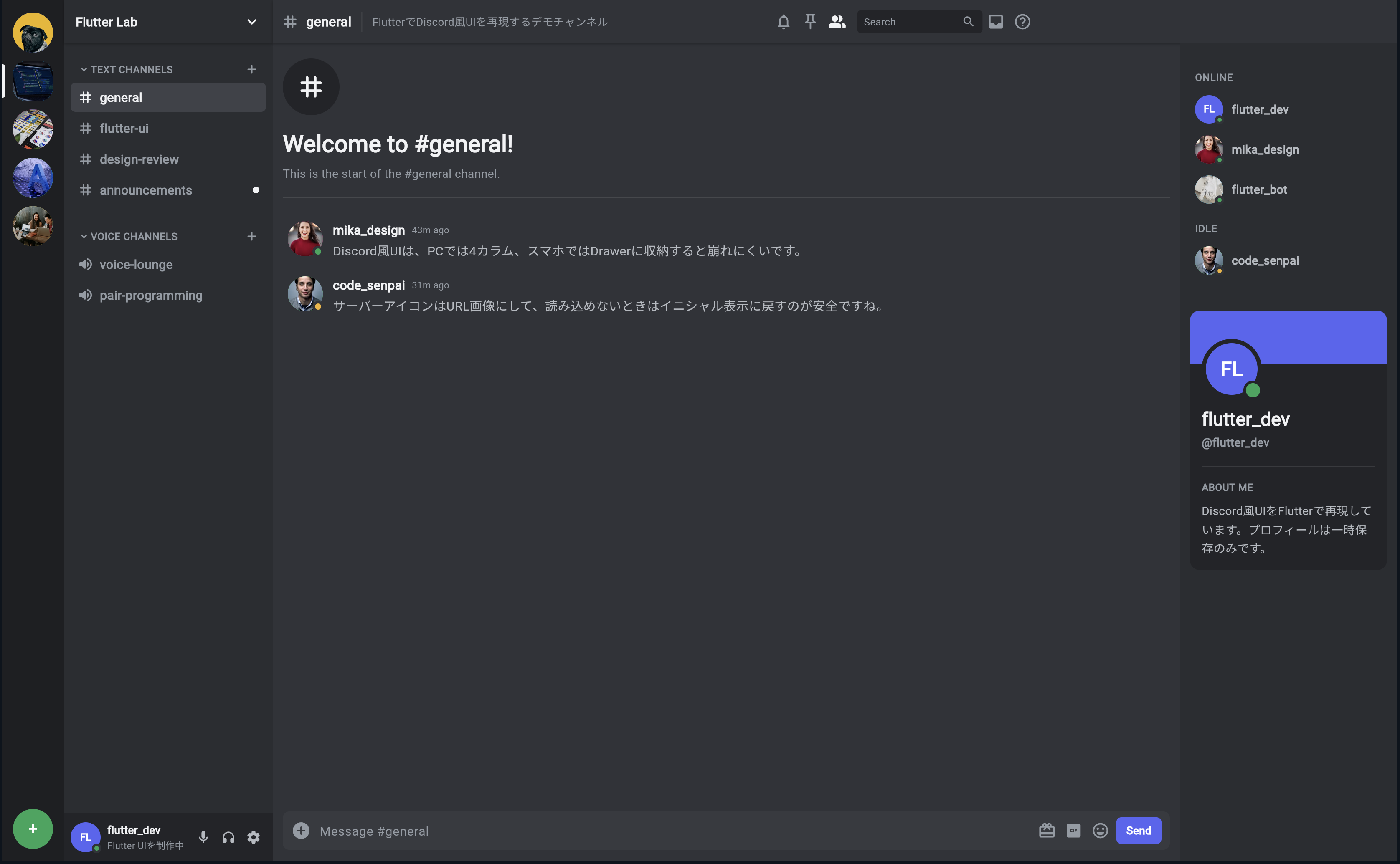
今回作る画面のイメージ
今回作るのは、次のような4カラム構造です。
┌────────┬──────────────┬────────────────────┬──────────────┐
│サーバー│チャンネル一覧│チャット画面          │メンバー一覧  │
│一覧    │              │                    │              │
│        │              │                    │              │
└────────┴──────────────┴────────────────────┴──────────────┘
FlutterのWidget構造で考えると、次のようになります。
Row
├─ ServerRail
├─ ChannelSidebar
├─ ChatArea
└─ MemberPanel
つまり、画面全体を横並びにしたいので、まず Row を使います。
Rowとは何か
Row は、Widgetを横方向に並べるためのWidgetです。
初心者向けには、次のように理解してください。
Row = 子Widgetを左から右へ横に並べるWidget
たとえば、次のように書くと、3つの箱が横に並びます。
Row(
  children: [
    Container(width: 80, color: Colors.red),
    Container(width: 120, color: Colors.green),
    Container(width: 200, color: Colors.blue),
  ],
)
Discord風アプリでは、これを使って4つの領域を横に並べます。
Row
├─ 左端のサーバー一覧
├─ チャンネル一覧
├─ チャット画面
└─ メンバー一覧
Columnとは何か
Column は、Widgetを縦方向に並べるためのWidgetです。
初心者向けには、次のように理解してください。
Column = 子Widgetを上から下へ縦に並べるWidget
たとえば、チャンネル一覧の中は、上から順に次のように並びます。
サーバー名
TEXT CHANNELS
# general
# flutter-ui
VOICE CHANNELS
🔊 voice-lounge
下部のユーザー情報
このような縦並びには Column を使います。
Column(
  children: [
    Text('Flutter Lab'),
    Text('TEXT CHANNELS'),
    Text('# general'),
    Text('# flutter-ui'),
  ],
)
RowとColumnの使い分け
Row と Column の違いを整理します。
| Widget | 並び方 | 使う場面 |
|---|---|---|
Row | 横に並べる | サーバー一覧、チャンネル一覧、チャット、メンバーを横に並べる |
Column | 縦に並べる | チャンネル名、メッセージ、プロフィール情報を縦に並べる |
Discord風アプリでは、この2つを組み合わせます。
画面全体
↓
Rowで横に分ける

それぞれの領域の中
↓
Columnで縦に並べる
まずは一番小さな4カラムを作る
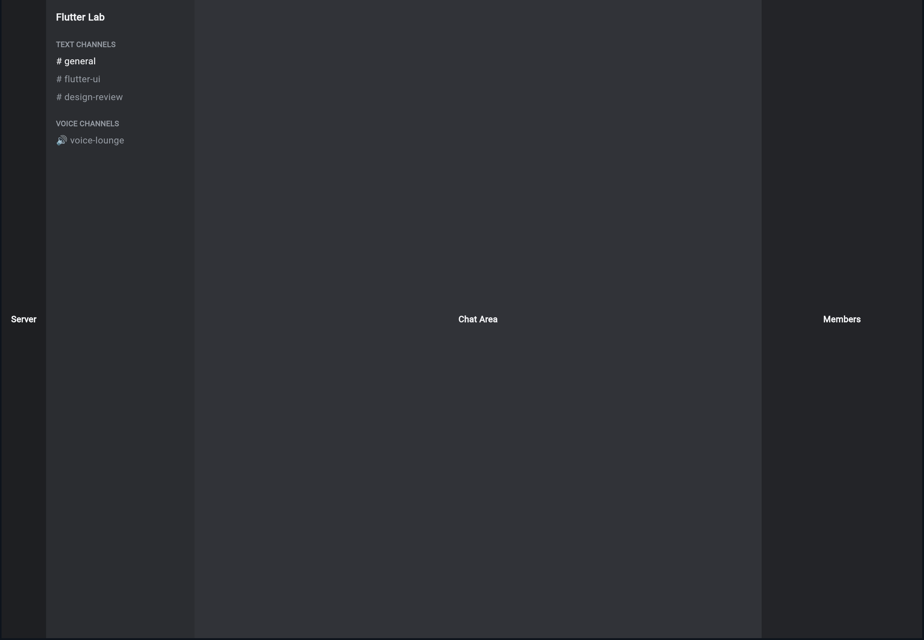
最初に、Discord風の見た目に近づける前に、4つの領域だけを色分けして表示します。
DartPadまたはFlutterプロジェクトの main.dart に、次のコードを貼り付けてください。
import 'package:flutter/material.dart';

void main() {
  runApp(const DiscordLayoutPracticeApp());
}

class DiscordLayoutPracticeApp extends StatelessWidget {
  const DiscordLayoutPracticeApp({super.key});

  @override
  Widget build(BuildContext context) {
    return const MaterialApp(
      debugShowCheckedModeBanner: false,
      home: DiscordLayoutPracticePage(),
    );
  }
}

class DiscordLayoutPracticePage extends StatelessWidget {
  const DiscordLayoutPracticePage({super.key});

  @override
  Widget build(BuildContext context) {
    return Scaffold(
      body: Row(
        children: [
          Container(
            width: 72,
            color: Colors.black87,
            child: const Center(
              child: Text(
                'Server',
                style: TextStyle(color: Colors.white),
              ),
            ),
          ),
          Container(
            width: 240,
            color: Colors.black54,
            child: const Center(
              child: Text(
                'Channels',
                style: TextStyle(color: Colors.white),
              ),
            ),
          ),
          Expanded(
            child: Container(
              color: Colors.blueGrey,
              child: const Center(
                child: Text(
                  'Chat Area',
                  style: TextStyle(color: Colors.white),
                ),
              ),
            ),
          ),
          Container(
            width: 260,
            color: Colors.black45,
            child: const Center(
              child: Text(
                'Members',
                style: TextStyle(color: Colors.white),
              ),
            ),
          ),
        ],
      ),
    );
  }
}
実行して確認すること
実行すると、画面が横に4つの領域に分かれます。
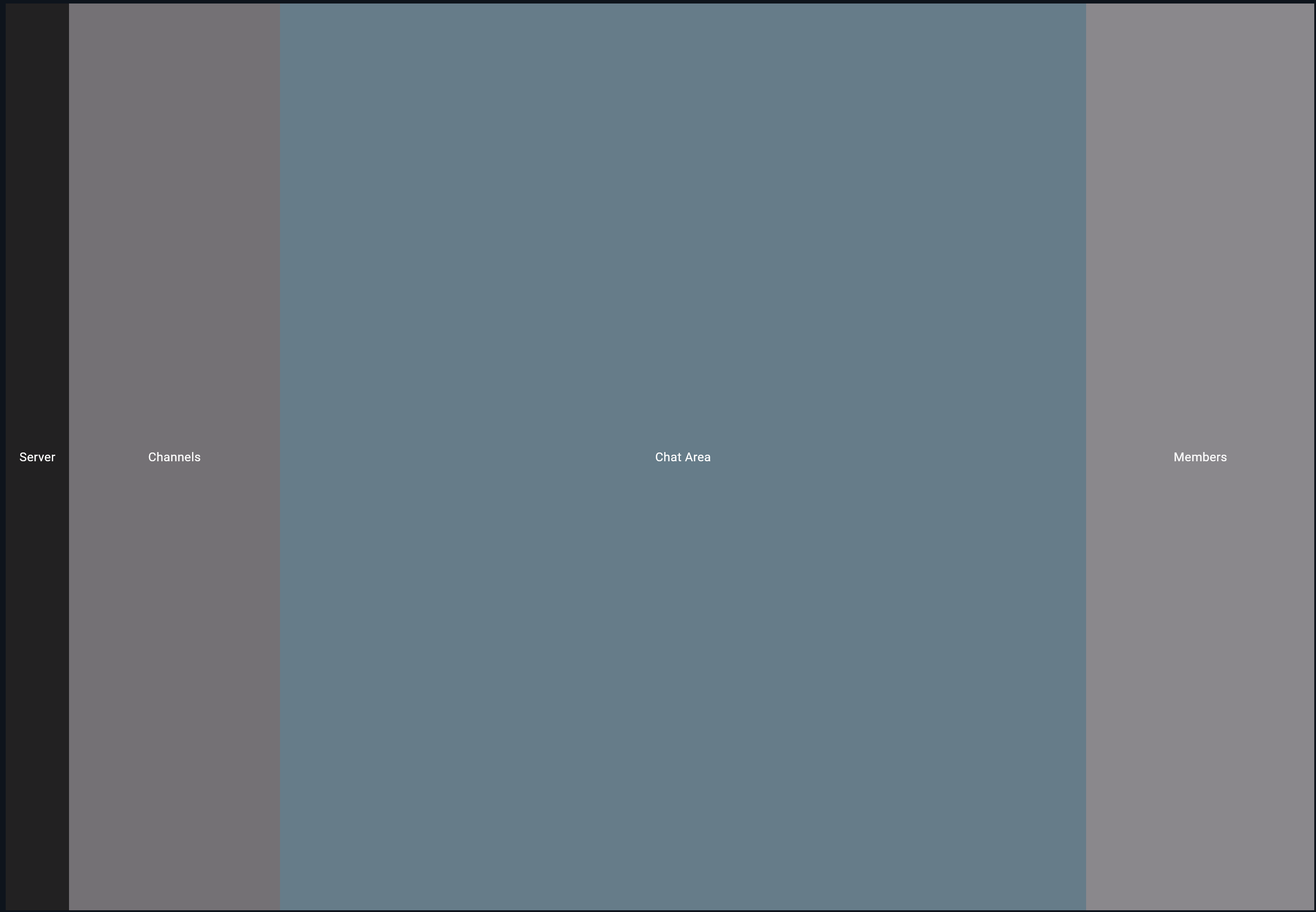
この段階では、まだDiscordらしい見た目ではありません。
しかし、とても重要な土台ができています。
サーバー一覧の場所
チャンネル一覧の場所
チャット画面の場所
メンバー一覧の場所
が決まりました。
Expandedとは何か
先ほどのコードでは、チャット画面だけ Expanded で包んでいます。
Expanded(
  child: Container(
    color: Colors.blueGrey,
    child: const Center(
      child: Text(
        'Chat Area',
        style: TextStyle(color: Colors.white),
      ),
    ),
  ),
),
Expanded は、残っているスペースを使うためのWidgetです。
初心者向けには、次のように理解してください。
Expanded = RowやColumnの中で、空いている場所を広げて使うWidget
今回の画面では、左のサーバー一覧は 72px、チャンネル一覧は 240px、右のメンバー一覧は 260px と固定しています。
残った横幅を、中央のチャット画面が使います。
固定幅:Server 72
固定幅:Channels 240
固定幅:Members 260
残り全部:Chat Area
Discord風アプリでは、チャット画面が一番大きく伸び縮みする領域なので、Expanded を使います。
widthを固定する場所と伸ばす場所
Discord風アプリでは、横幅の考え方が大切です。
| 領域 | 幅の考え方 |
|---|---|
| サーバー一覧 | 固定幅 |
| チャンネル一覧 | 固定幅 |
| チャット画面 | 残りの幅を使う |
| メンバー一覧 | 固定幅 |
コードにすると、次のようになります。
Row(
  children: [
    SizedBox(width: 72, child: ServerRail()),
    SizedBox(width: 240, child: ChannelSidebar()),
    Expanded(child: ChatArea()),
    SizedBox(width: 260, child: MemberPanel()),
  ],
)
この構造は、今後の完成アプリでも基本になります。
固定幅
固定幅
可変幅
固定幅
という考え方を覚えてください。
SizedBoxとContainerの違い
ここで SizedBox と Container の違いも確認しておきます。
| Widget | 主な役割 |
|---|---|
SizedBox | 幅や高さを指定する |
Container | 幅・高さ・色・余白・装飾などを指定できる |
最初の練習では、色をつけたいので Container を使いました。
Container(
  width: 72,
  color: Colors.black87,
)
ただし、完成コードでは、幅だけを指定したい場面では SizedBox を使うことも多いです。
SizedBox(
  width: 72,
  child: ServerRail(),
)
初心者のうちは、次のように考えると分かりやすいです。
幅や高さだけならSizedBox
色や装飾もつけるならContainer
Discord風カラーに近づける
次に、色をDiscord風のダークカラーに近づけます。
先ほどのコードを少し変更します。
import 'package:flutter/material.dart';

void main() {
  runApp(const DiscordLayoutPracticeApp());
}

class DiscordLayoutPracticeApp extends StatelessWidget {
  const DiscordLayoutPracticeApp({super.key});

  @override
  Widget build(BuildContext context) {
    return const MaterialApp(
      debugShowCheckedModeBanner: false,
      home: DiscordLayoutPracticePage(),
    );
  }
}

class DiscordColors {
  static const Color appRail = Color(0xFF1E1F22);
  static const Color sidebar = Color(0xFF2B2D31);
  static const Color background = Color(0xFF313338);
  static const Color memberPanel = Color(0xFF232428);
  static const Color textPrimary = Color(0xFFF2F3F5);
  static const Color textMuted = Color(0xFF949BA4);
}

class DiscordLayoutPracticePage extends StatelessWidget {
  const DiscordLayoutPracticePage({super.key});

  @override
  Widget build(BuildContext context) {
    return Scaffold(
      backgroundColor: DiscordColors.background,
      body: Row(
        children: [
          Container(
            width: 72,
            color: DiscordColors.appRail,
            child: const Center(
              child: Text(
                'Server',
                style: TextStyle(color: DiscordColors.textPrimary),
              ),
            ),
          ),
          Container(
            width: 240,
            color: DiscordColors.sidebar,
            child: const Center(
              child: Text(
                'Channels',
                style: TextStyle(color: DiscordColors.textPrimary),
              ),
            ),
          ),
          Expanded(
            child: Container(
              color: DiscordColors.background,
              child: const Center(
                child: Text(
                  'Chat Area',
                  style: TextStyle(color: DiscordColors.textPrimary),
                ),
              ),
            ),
          ),
          Container(
            width: 260,
            color: DiscordColors.memberPanel,
            child: const Center(
              child: Text(
                'Members',
                style: TextStyle(color: DiscordColors.textPrimary),
              ),
            ),
          ),
        ],
      ),
    );
  }
}
色をclassにまとめる理由
ここでは、色を DiscordColors というclassにまとめました。
class DiscordColors {
  static const Color appRail = Color(0xFF1E1F22);
  static const Color sidebar = Color(0xFF2B2D31);
  static const Color background = Color(0xFF313338);
}
色を直接いろいろな場所に書くと、あとから変更しにくくなります。
color: Color(0xFF313338)
これが何度も出てくると、どこを直せばいいか分かりにくくなります。
そこで、色に名前をつけてまとめます。
color: DiscordColors.background
このようにすると、意味が分かりやすくなります。
DiscordColors.appRail
↓
左端のサーバー一覧の色

DiscordColors.sidebar
↓
チャンネル一覧の色

DiscordColors.background
↓
チャット背景の色
4つの領域をWidgetに分ける
次に、4つの領域をそれぞれWidgetとして分けます。
今は Row の中に直接 Container を書いています。
Row(
  children: [
    Container(...),
    Container(...),
    Expanded(child: Container(...)),
    Container(...),
  ],
)
これでも動きます。
しかし、今後コードが長くなると読みにくくなります。
そこで、次のようにWidgetに分けます。
ServerRail
ChannelSidebar
ChatArea
MemberPanel
このように分けると、画面全体の構造が分かりやすくなります。
Widgetに分けたコード
次のコードを貼り付けて実行してください。
import 'package:flutter/material.dart';

void main() {
  runApp(const DiscordLayoutPracticeApp());
}

class DiscordLayoutPracticeApp extends StatelessWidget {
  const DiscordLayoutPracticeApp({super.key});

  @override
  Widget build(BuildContext context) {
    return const MaterialApp(
      debugShowCheckedModeBanner: false,
      home: DiscordLayoutPracticePage(),
    );
  }
}

class DiscordColors {
  static const Color appRail = Color(0xFF1E1F22);
  static const Color sidebar = Color(0xFF2B2D31);
  static const Color background = Color(0xFF313338);
  static const Color memberPanel = Color(0xFF232428);
  static const Color textPrimary = Color(0xFFF2F3F5);
  static const Color textMuted = Color(0xFF949BA4);
}

class DiscordLayoutPracticePage extends StatelessWidget {
  const DiscordLayoutPracticePage({super.key});

  @override
  Widget build(BuildContext context) {
    return const Scaffold(
      backgroundColor: DiscordColors.background,
      body: Row(
        children: [
          SizedBox(
            width: 72,
            child: ServerRail(),
          ),
          SizedBox(
            width: 240,
            child: ChannelSidebar(),
          ),
          Expanded(
            child: ChatArea(),
          ),
          SizedBox(
            width: 260,
            child: MemberPanel(),
          ),
        ],
      ),
    );
  }
}

class ServerRail extends StatelessWidget {
  const ServerRail({super.key});

  @override
  Widget build(BuildContext context) {
    return Container(
      color: DiscordColors.appRail,
      child: const Center(
        child: Text(
          'Server',
          style: TextStyle(
            color: DiscordColors.textPrimary,
            fontWeight: FontWeight.bold,
          ),
        ),
      ),
    );
  }
}

class ChannelSidebar extends StatelessWidget {
  const ChannelSidebar({super.key});

  @override
  Widget build(BuildContext context) {
    return Container(
      color: DiscordColors.sidebar,
      child: const Center(
        child: Text(
          'Channels',
          style: TextStyle(
            color: DiscordColors.textPrimary,
            fontWeight: FontWeight.bold,
          ),
        ),
      ),
    );
  }
}

class ChatArea extends StatelessWidget {
  const ChatArea({super.key});

  @override
  Widget build(BuildContext context) {
    return Container(
      color: DiscordColors.background,
      child: const Center(
        child: Text(
          'Chat Area',
          style: TextStyle(
            color: DiscordColors.textPrimary,
            fontWeight: FontWeight.bold,
          ),
        ),
      ),
    );
  }
}

class MemberPanel extends StatelessWidget {
  const MemberPanel({super.key});

  @override
  Widget build(BuildContext context) {
    return Container(
      color: DiscordColors.memberPanel,
      child: const Center(
        child: Text(
          'Members',
          style: TextStyle(
            color: DiscordColors.textPrimary,
            fontWeight: FontWeight.bold,
          ),
        ),
      ),
    );
  }
}
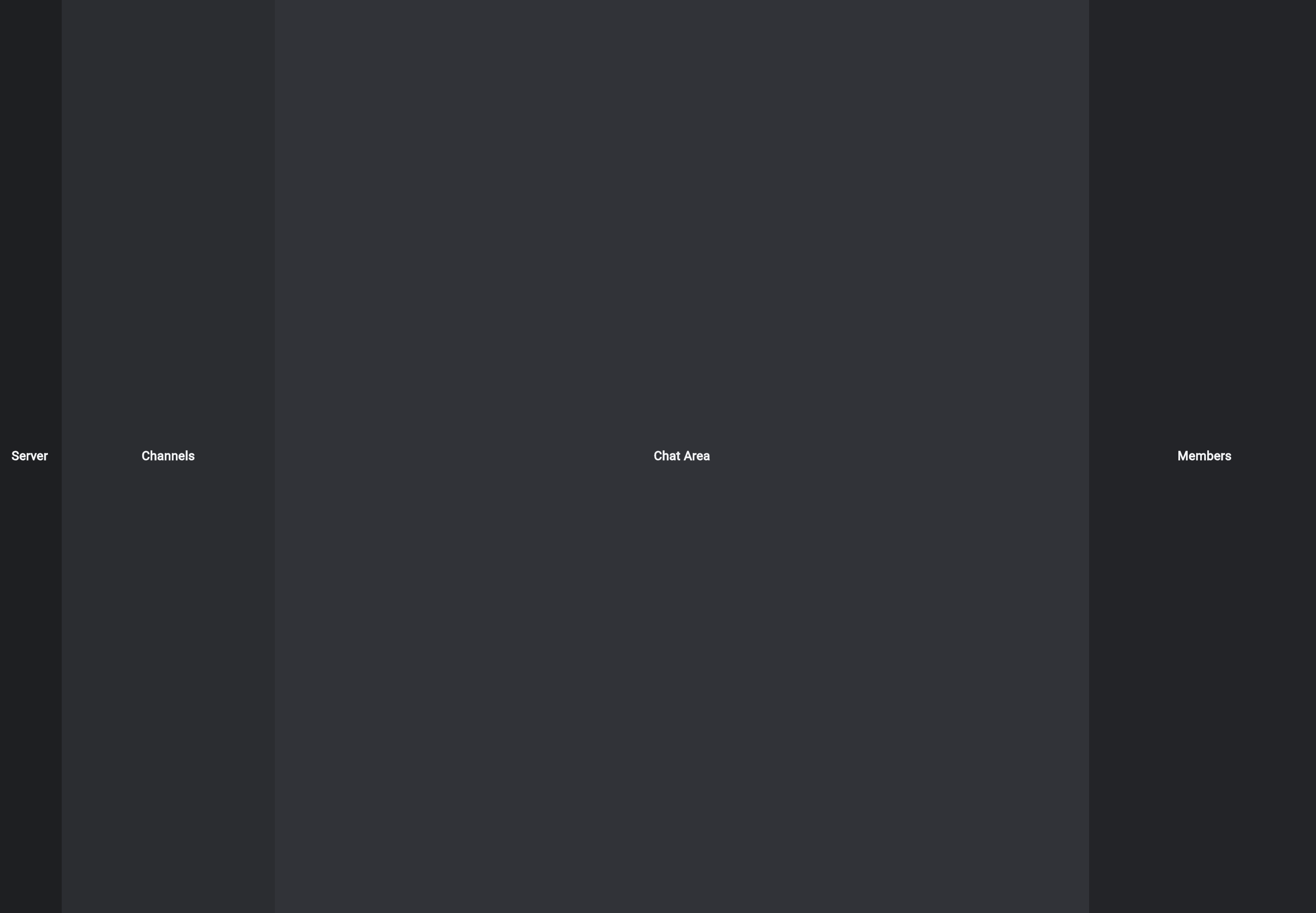
実行して確認すること
見た目は先ほどとほとんど同じです。
しかし、コードの読みやすさが大きく変わっています。
画面全体の構造を見ると、こうなっています。
Row(
  children: [
    SizedBox(width: 72, child: ServerRail()),
    SizedBox(width: 240, child: ChannelSidebar()),
    Expanded(child: ChatArea()),
    SizedBox(width: 260, child: MemberPanel()),
  ],
)
これは、かなり読みやすいです。
左から
ServerRail
ChannelSidebar
ChatArea
MemberPanel
が並んでいる
とすぐに分かります。
Columnを使ってチャンネル一覧らしくする
次に、ChannelSidebar の中を少しだけDiscordらしくします。
チャンネル一覧は、縦に情報が並びます。
Flutter Lab
TEXT CHANNELS
# general
# flutter-ui
# design-review
VOICE CHANNELS
voice-lounge
これは Column で作れます。
ChannelSidebar だけを、次のコードに差し替えてください。
class ChannelSidebar extends StatelessWidget {
  const ChannelSidebar({super.key});

  @override
  Widget build(BuildContext context) {
    return Container(
      color: DiscordColors.sidebar,
      child: const Column(
        crossAxisAlignment: CrossAxisAlignment.start,
        children: [
          SizedBox(height: 16),
          Padding(
            padding: EdgeInsets.symmetric(horizontal: 16),
            child: Text(
              'Flutter Lab',
              style: TextStyle(
                color: DiscordColors.textPrimary,
                fontSize: 16,
                fontWeight: FontWeight.bold,
              ),
            ),
          ),
          SizedBox(height: 24),
          Padding(
            padding: EdgeInsets.symmetric(horizontal: 16),
            child: Text(
              'TEXT CHANNELS',
              style: TextStyle(
                color: DiscordColors.textMuted,
                fontSize: 12,
                fontWeight: FontWeight.bold,
              ),
            ),
          ),
          SizedBox(height: 8),
          Padding(
            padding: EdgeInsets.symmetric(horizontal: 16),
            child: Text(
              '# general',
              style: TextStyle(
                color: DiscordColors.textPrimary,
                fontSize: 15,
              ),
            ),
          ),
          SizedBox(height: 8),
          Padding(
            padding: EdgeInsets.symmetric(horizontal: 16),
            child: Text(
              '# flutter-ui',
              style: TextStyle(
                color: DiscordColors.textMuted,
                fontSize: 15,
              ),
            ),
          ),
          SizedBox(height: 8),
          Padding(
            padding: EdgeInsets.symmetric(horizontal: 16),
            child: Text(
              '# design-review',
              style: TextStyle(
                color: DiscordColors.textMuted,
                fontSize: 15,
              ),
            ),
          ),
          SizedBox(height: 24),
          Padding(
            padding: EdgeInsets.symmetric(horizontal: 16),
            child: Text(
              'VOICE CHANNELS',
              style: TextStyle(
                color: DiscordColors.textMuted,
                fontSize: 12,
                fontWeight: FontWeight.bold,
              ),
            ),
          ),
          SizedBox(height: 8),
          Padding(
            padding: EdgeInsets.symmetric(horizontal: 16),
            child: Text(
              '🔊 voice-lounge',
              style: TextStyle(
                color: DiscordColors.textMuted,
                fontSize: 15,
              ),
            ),
          ),
        ],
      ),
    );
  }
}
crossAxisAlignmentとは何か
Column の中に、次の設定があります。
crossAxisAlignment: CrossAxisAlignment.start,
これは、子Widgetを左揃えにする設定です。
Column は縦に並べるWidgetですが、横方向の揃え方も必要です。
Columnのメイン方向
↓
縦

Columnの横方向
↓
crossAxis
CrossAxisAlignment.start にすると、左揃えになります。
Discordのチャンネル一覧は左揃えなので、この設定が自然です。
Paddingとは何か
Padding は、内側や周囲に余白を作るWidgetです。
Padding(
  padding: EdgeInsets.symmetric(horizontal: 16),
  child: Text('# general'),
)
これは、左右に16pxの余白を入れるという意味です。
左16pxの余白
テキスト
右16pxの余白
UIでは、文字が端にくっつくと読みにくくなります。
そのため、Padding で適度な余白を作ります。
ChatAreaをColumnで作る
次に、中央のチャット画面を少しだけ作ります。
チャット画面は、上にメッセージ一覧、下に入力欄があります。
ChatArea
├─ メッセージ一覧
└─ 入力欄
つまり、縦並びなので Column を使います。
ChatArea を次のコードに差し替えてください。
class ChatArea extends StatelessWidget {
  const ChatArea({super.key});

  @override
  Widget build(BuildContext context) {
    return Container(
      color: DiscordColors.background,
      child: Column(
        children: [
          Expanded(
            child: Container(
              padding: const EdgeInsets.all(24),
              alignment: Alignment.topLeft,
              child: const Column(
                crossAxisAlignment: CrossAxisAlignment.start,
                children: [
                  Text(
                    'Welcome to #general!',
                    style: TextStyle(
                      color: DiscordColors.textPrimary,
                      fontSize: 28,
                      fontWeight: FontWeight.bold,
                    ),
                  ),
                  SizedBox(height: 8),
                  Text(
                    'This is the start of the #general channel.',
                    style: TextStyle(
                      color: DiscordColors.textMuted,
                      fontSize: 14,
                    ),
                  ),
                  SizedBox(height: 32),
                  Text(
                    'mika_design: Discord風UIをFlutterで作ってみましょう。',
                    style: TextStyle(
                      color: DiscordColors.textPrimary,
                      fontSize: 15,
                    ),
                  ),
                  SizedBox(height: 12),
                  Text(
                    'code_senpai: RowとColumnだけでも大枠は作れます。',
                    style: TextStyle(
                      color: DiscordColors.textPrimary,
                      fontSize: 15,
                    ),
                  ),
                ],
              ),
            ),
          ),
          Container(
            height: 64,
            padding: const EdgeInsets.all(12),
            child: Container(
              alignment: Alignment.centerLeft,
              padding: const EdgeInsets.symmetric(horizontal: 16),
              decoration: BoxDecoration(
                color: Color(0xFF383A40),
                borderRadius: BorderRadius.all(Radius.circular(8)),
              ),
              child: const Text(
                'Message #general',
                style: TextStyle(
                  color: DiscordColors.textMuted,
                  fontSize: 15,
                ),
              ),
            ),
          ),
        ],
      ),
    );
  }
}
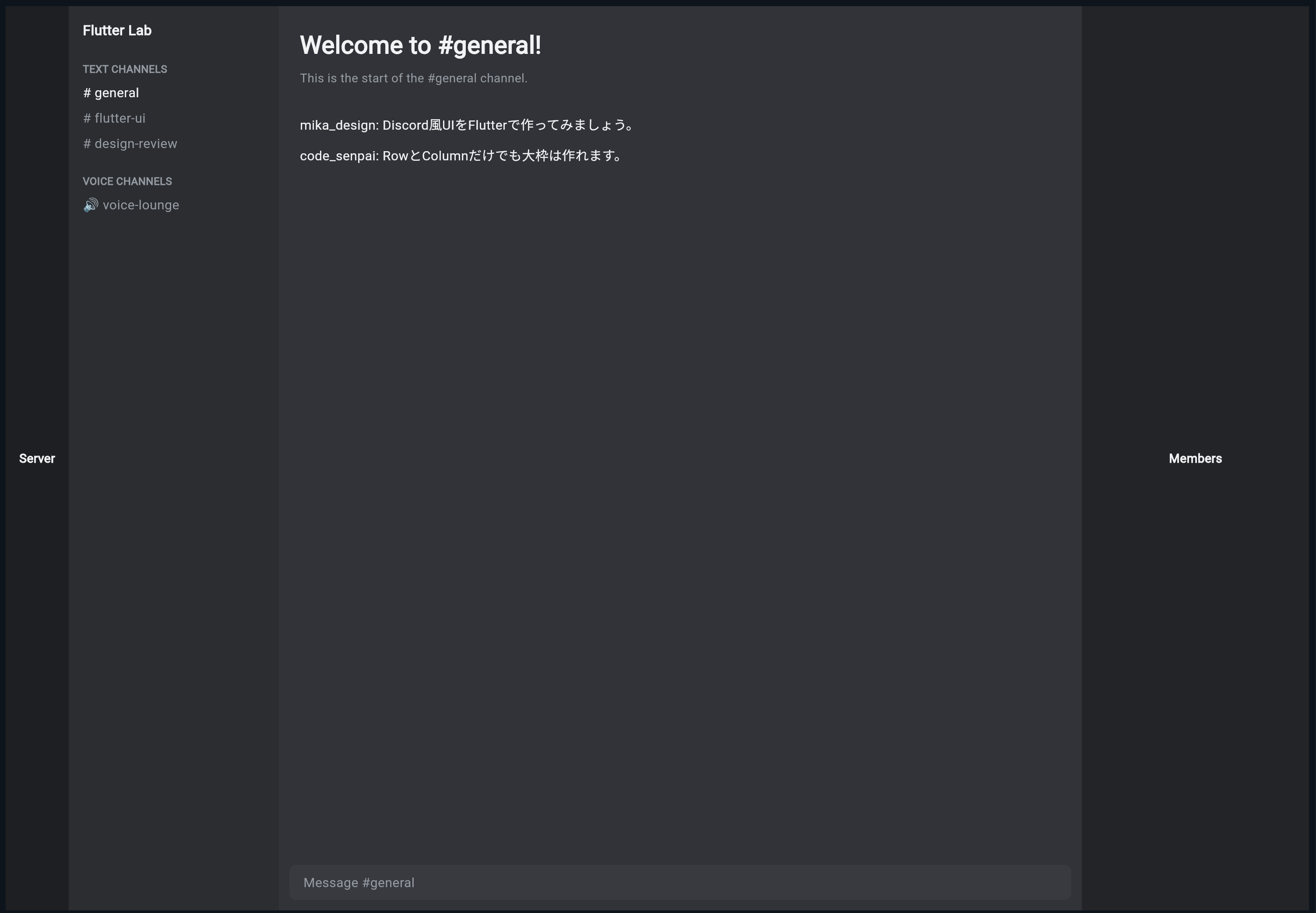
ChatAreaでExpandedを使う理由
ChatArea の中でも Expanded を使っています。
Expanded(
  child: Container(
    ...
  ),
),
これは、入力欄以外の残りの高さを、メッセージ一覧が使うためです。
ChatAreaの中
├─ メッセージ一覧:残り全部
└─ 入力欄:高さ64px
横方向だけでなく、縦方向でも Expanded は使えます。
Column の中で Expanded を使うと、縦方向の残りスペースを使います。
MemberPanelをColumnで作る
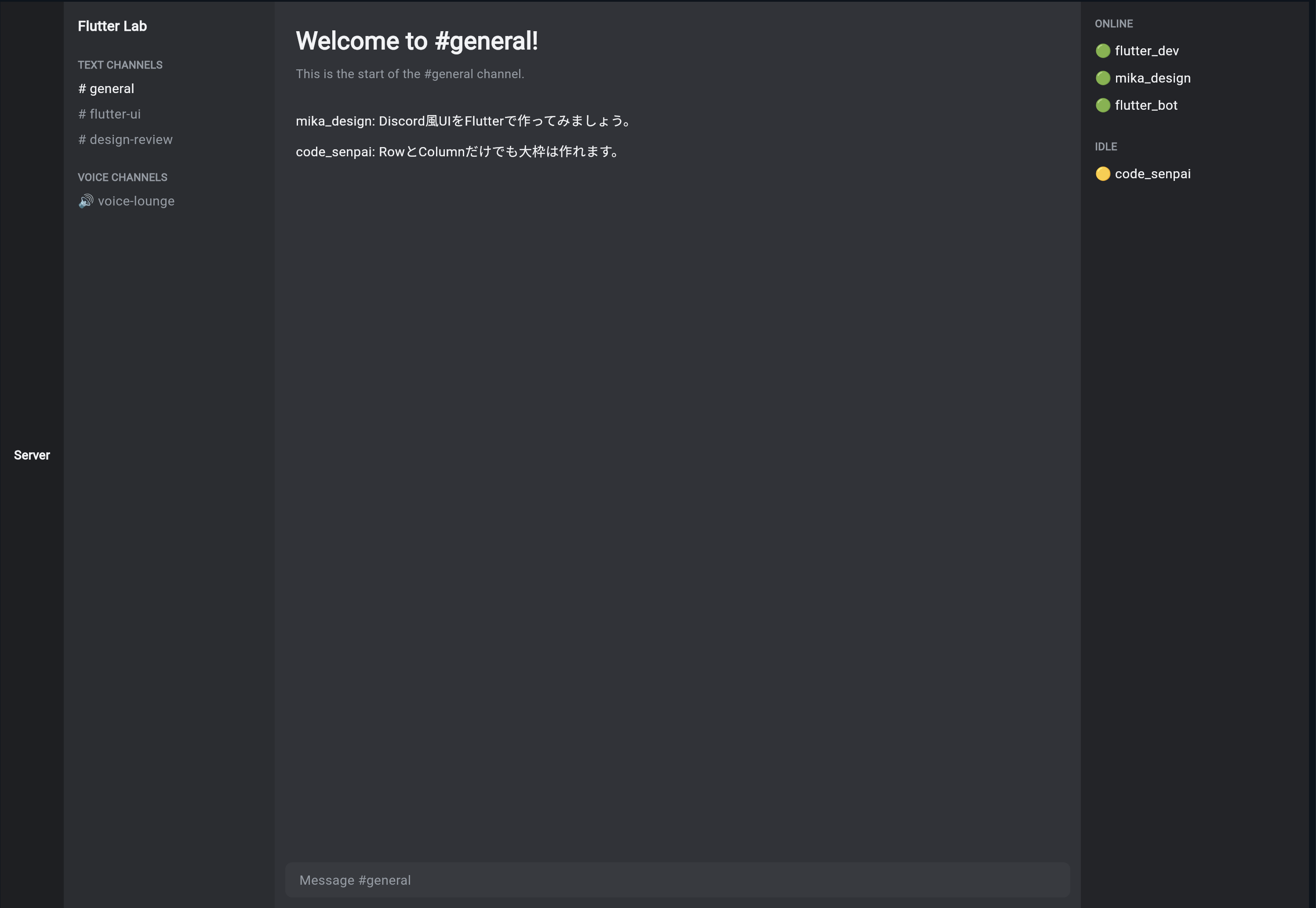
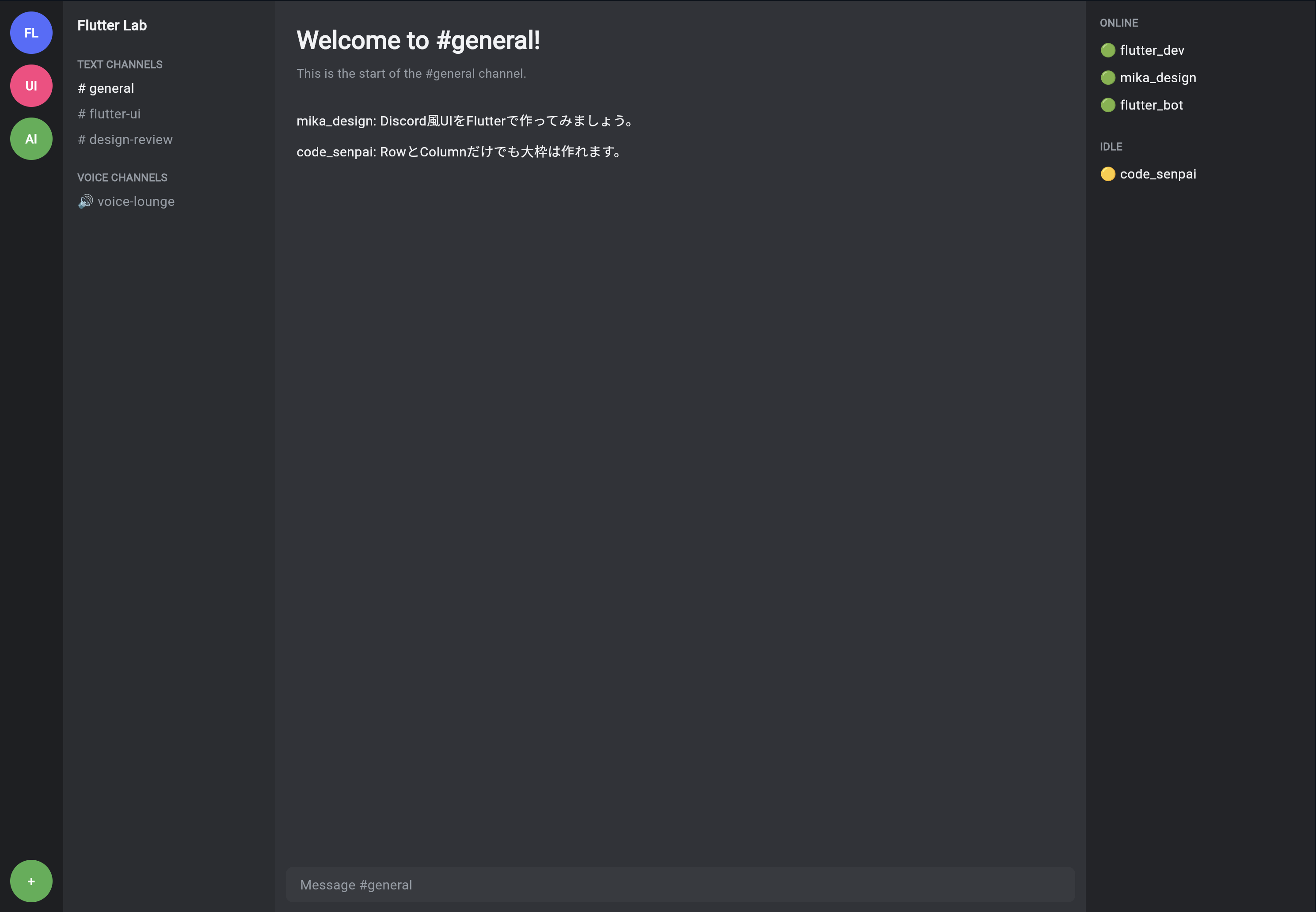
右側のメンバー一覧も、縦に情報が並びます。
ONLINE
flutter_dev
mika_design
flutter_bot

IDLE
code_senpai

ProfileCard
MemberPanel を次のコードに差し替えてください。
class MemberPanel extends StatelessWidget {
  const MemberPanel({super.key});

  @override
  Widget build(BuildContext context) {
    return Container(
      color: DiscordColors.memberPanel,
      child: const Padding(
        padding: EdgeInsets.all(16),
        child: Column(
          crossAxisAlignment: CrossAxisAlignment.start,
          children: [
            Text(
              'ONLINE',
              style: TextStyle(
                color: DiscordColors.textMuted,
                fontSize: 12,
                fontWeight: FontWeight.bold,
              ),
            ),
            SizedBox(height: 12),
            Text(
              '🟢 flutter_dev',
              style: TextStyle(
                color: DiscordColors.textPrimary,
                fontSize: 15,
              ),
            ),
            SizedBox(height: 10),
            Text(
              '🟢 mika_design',
              style: TextStyle(
                color: DiscordColors.textPrimary,
                fontSize: 15,
              ),
            ),
            SizedBox(height: 10),
            Text(
              '🟢 flutter_bot',
              style: TextStyle(
                color: DiscordColors.textPrimary,
                fontSize: 15,
              ),
            ),
            SizedBox(height: 28),
            Text(
              'IDLE',
              style: TextStyle(
                color: DiscordColors.textMuted,
                fontSize: 12,
                fontWeight: FontWeight.bold,
              ),
            ),
            SizedBox(height: 12),
            Text(
              '🟡 code_senpai',
              style: TextStyle(
                color: DiscordColors.textPrimary,
                fontSize: 15,
              ),
            ),
          ],
        ),
      ),
    );
  }
}
これで、右側も少しDiscord風になってきます。
ServerRailをColumnで作る
左端のサーバー一覧は、丸いアイコンが縦に並んでいます。
これも Column で作れます。
ServerRail を次のコードに差し替えてください。
class ServerRail extends StatelessWidget {
  const ServerRail({super.key});

  @override
  Widget build(BuildContext context) {
    return Container(
      color: DiscordColors.appRail,
      child: Column(
        children: [
          const SizedBox(height: 12),
          _serverIcon('FL', Colors.indigoAccent),
          const SizedBox(height: 12),
          _serverIcon('UI', Colors.pinkAccent),
          const SizedBox(height: 12),
          _serverIcon('AI', Colors.green),
          const Spacer(),
          _serverIcon('+', Colors.green),
          const SizedBox(height: 12),
        ],
      ),
    );
  }

  Widget _serverIcon(String label, Color color) {
    return Container(
      width: 48,
      height: 48,
      alignment: Alignment.center,
      decoration: BoxDecoration(
        color: color,
        shape: BoxShape.circle,
      ),
      child: Text(
        label,
        style: const TextStyle(
          color: Colors.white,
          fontWeight: FontWeight.bold,
        ),
      ),
    );
  }
}
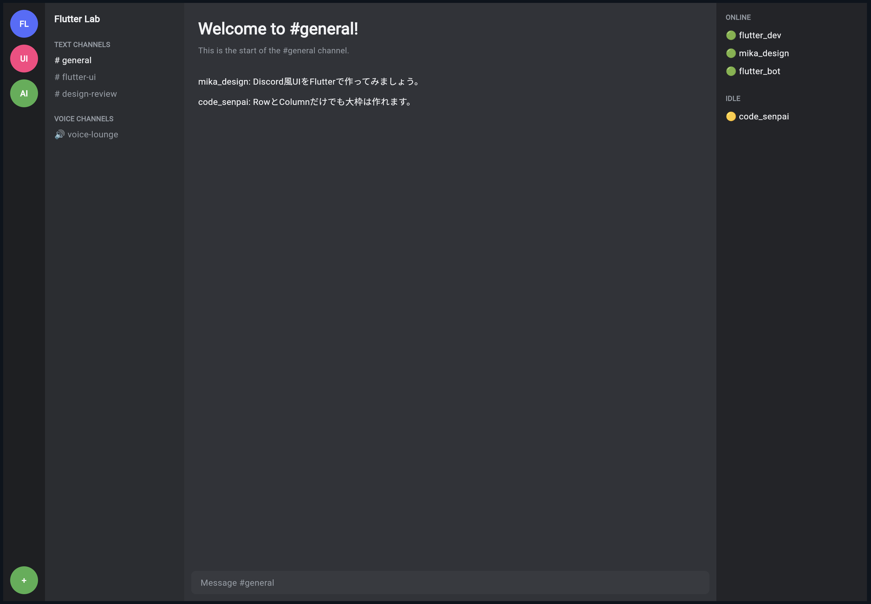
Spacerとは何か
ServerRail の中で、次のWidgetを使っています。
const Spacer(),
Spacer は、空いているスペースを埋めるためのWidgetです。
今回の場合、上にサーバーアイコン、下に追加ボタンを置きたいので、間に Spacer を入れています。
サーバーアイコン
サーバーアイコン
サーバーアイコン
↓
Spacerで余白を広げる
↓
追加ボタン
縦方向に部品を上下に分けたいときに便利です。
ここまでの完成コード
ここまでの内容をまとめたコードです。
import 'package:flutter/material.dart';

void main() {
  runApp(const DiscordLayoutPracticeApp());
}

class DiscordLayoutPracticeApp extends StatelessWidget {
  const DiscordLayoutPracticeApp({super.key});

  @override
  Widget build(BuildContext context) {
    return const MaterialApp(
      debugShowCheckedModeBanner: false,
      home: DiscordLayoutPracticePage(),
    );
  }
}

class DiscordColors {
  static const Color appRail = Color(0xFF1E1F22);
  static const Color sidebar = Color(0xFF2B2D31);
  static const Color background = Color(0xFF313338);
  static const Color memberPanel = Color(0xFF232428);
  static const Color input = Color(0xFF383A40);
  static const Color textPrimary = Color(0xFFF2F3F5);
  static const Color textMuted = Color(0xFF949BA4);
}

class DiscordLayoutPracticePage extends StatelessWidget {
  const DiscordLayoutPracticePage({super.key});

  @override
  Widget build(BuildContext context) {
    return const Scaffold(
      backgroundColor: DiscordColors.background,
      body: Row(
        children: [
          SizedBox(
            width: 72,
            child: ServerRail(),
          ),
          SizedBox(
            width: 240,
            child: ChannelSidebar(),
          ),
          Expanded(
            child: ChatArea(),
          ),
          SizedBox(
            width: 260,
            child: MemberPanel(),
          ),
        ],
      ),
    );
  }
}

class ServerRail extends StatelessWidget {
  const ServerRail({super.key});

  @override
  Widget build(BuildContext context) {
    return Container(
      color: DiscordColors.appRail,
      child: Column(
        children: [
          const SizedBox(height: 12),
          _serverIcon('FL', Colors.indigoAccent),
          const SizedBox(height: 12),
          _serverIcon('UI', Colors.pinkAccent),
          const SizedBox(height: 12),
          _serverIcon('AI', Colors.green),
          const Spacer(),
          _serverIcon('+', Colors.green),
          const SizedBox(height: 12),
        ],
      ),
    );
  }

  Widget _serverIcon(String label, Color color) {
    return Container(
      width: 48,
      height: 48,
      alignment: Alignment.center,
      decoration: BoxDecoration(
        color: color,
        shape: BoxShape.circle,
      ),
      child: Text(
        label,
        style: const TextStyle(
          color: Colors.white,
          fontWeight: FontWeight.bold,
        ),
      ),
    );
  }
}

class ChannelSidebar extends StatelessWidget {
  const ChannelSidebar({super.key});

  @override
  Widget build(BuildContext context) {
    return Container(
      color: DiscordColors.sidebar,
      child: const Column(
        crossAxisAlignment: CrossAxisAlignment.start,
        children: [
          SizedBox(height: 16),
          Padding(
            padding: EdgeInsets.symmetric(horizontal: 16),
            child: Text(
              'Flutter Lab',
              style: TextStyle(
                color: DiscordColors.textPrimary,
                fontSize: 16,
                fontWeight: FontWeight.bold,
              ),
            ),
          ),
          SizedBox(height: 24),
          Padding(
            padding: EdgeInsets.symmetric(horizontal: 16),
            child: Text(
              'TEXT CHANNELS',
              style: TextStyle(
                color: DiscordColors.textMuted,
                fontSize: 12,
                fontWeight: FontWeight.bold,
              ),
            ),
          ),
          SizedBox(height: 8),
          Padding(
            padding: EdgeInsets.symmetric(horizontal: 16),
            child: Text(
              '# general',
              style: TextStyle(
                color: DiscordColors.textPrimary,
                fontSize: 15,
              ),
            ),
          ),
          SizedBox(height: 8),
          Padding(
            padding: EdgeInsets.symmetric(horizontal: 16),
            child: Text(
              '# flutter-ui',
              style: TextStyle(
                color: DiscordColors.textMuted,
                fontSize: 15,
              ),
            ),
          ),
          SizedBox(height: 8),
          Padding(
            padding: EdgeInsets.symmetric(horizontal: 16),
            child: Text(
              '# design-review',
              style: TextStyle(
                color: DiscordColors.textMuted,
                fontSize: 15,
              ),
            ),
          ),
          SizedBox(height: 24),
          Padding(
            padding: EdgeInsets.symmetric(horizontal: 16),
            child: Text(
              'VOICE CHANNELS',
              style: TextStyle(
                color: DiscordColors.textMuted,
                fontSize: 12,
                fontWeight: FontWeight.bold,
              ),
            ),
          ),
          SizedBox(height: 8),
          Padding(
            padding: EdgeInsets.symmetric(horizontal: 16),
            child: Text(
              '🔊 voice-lounge',
              style: TextStyle(
                color: DiscordColors.textMuted,
                fontSize: 15,
              ),
            ),
          ),
        ],
      ),
    );
  }
}

class ChatArea extends StatelessWidget {
  const ChatArea({super.key});

  @override
  Widget build(BuildContext context) {
    return Container(
      color: DiscordColors.background,
      child: Column(
        children: [
          Expanded(
            child: Container(
              padding: const EdgeInsets.all(24),
              alignment: Alignment.topLeft,
              child: const Column(
                crossAxisAlignment: CrossAxisAlignment.start,
                children: [
                  Text(
                    'Welcome to #general!',
                    style: TextStyle(
                      color: DiscordColors.textPrimary,
                      fontSize: 28,
                      fontWeight: FontWeight.bold,
                    ),
                  ),
                  SizedBox(height: 8),
                  Text(
                    'This is the start of the #general channel.',
                    style: TextStyle(
                      color: DiscordColors.textMuted,
                      fontSize: 14,
                    ),
                  ),
                  SizedBox(height: 32),
                  Text(
                    'mika_design: Discord風UIをFlutterで作ってみましょう。',
                    style: TextStyle(
                      color: DiscordColors.textPrimary,
                      fontSize: 15,
                    ),
                  ),
                  SizedBox(height: 12),
                  Text(
                    'code_senpai: RowとColumnだけでも大枠は作れます。',
                    style: TextStyle(
                      color: DiscordColors.textPrimary,
                      fontSize: 15,
                    ),
                  ),
                ],
              ),
            ),
          ),
          Container(
            height: 64,
            padding: const EdgeInsets.all(12),
            child: Container(
              alignment: Alignment.centerLeft,
              padding: const EdgeInsets.symmetric(horizontal: 16),
              decoration: BoxDecoration(
                color: DiscordColors.input,
                borderRadius: const BorderRadius.all(Radius.circular(8)),
              ),
              child: const Text(
                'Message #general',
                style: TextStyle(
                  color: DiscordColors.textMuted,
                  fontSize: 15,
                ),
              ),
            ),
          ),
        ],
      ),
    );
  }
}

class MemberPanel extends StatelessWidget {
  const MemberPanel({super.key});

  @override
  Widget build(BuildContext context) {
    return Container(
      color: DiscordColors.memberPanel,
      child: const Padding(
        padding: EdgeInsets.all(16),
        child: Column(
          crossAxisAlignment: CrossAxisAlignment.start,
          children: [
            Text(
              'ONLINE',
              style: TextStyle(
                color: DiscordColors.textMuted,
                fontSize: 12,
                fontWeight: FontWeight.bold,
              ),
            ),
            SizedBox(height: 12),
            Text(
              '🟢 flutter_dev',
              style: TextStyle(
                color: DiscordColors.textPrimary,
                fontSize: 15,
              ),
            ),
            SizedBox(height: 10),
            Text(
              '🟢 mika_design',
              style: TextStyle(
                color: DiscordColors.textPrimary,
                fontSize: 15,
              ),
            ),
            SizedBox(height: 10),
            Text(
              '🟢 flutter_bot',
              style: TextStyle(
                color: DiscordColors.textPrimary,
                fontSize: 15,
              ),
            ),
            SizedBox(height: 28),
            Text(
              'IDLE',
              style: TextStyle(
                color: DiscordColors.textMuted,
                fontSize: 12,
                fontWeight: FontWeight.bold,
              ),
            ),
            SizedBox(height: 12),
            Text(
              '🟡 code_senpai',
              style: TextStyle(
                color: DiscordColors.textPrimary,
                fontSize: 15,
              ),
            ),
          ],
        ),
      ),
    );
  }
}
今回のコードの構造を確認する
今回のコードは、次のような構造になっています。
DiscordLayoutPracticeApp
└─ MaterialApp
   └─ DiscordLayoutPracticePage
      └─ Scaffold
         └─ Row
            ├─ ServerRail
            ├─ ChannelSidebar
            ├─ ChatArea
            └─ MemberPanel
それぞれの中では、Column を使って縦方向に部品を並べています。
ServerRail
└─ Column
   ├─ サーバーアイコン
   ├─ サーバーアイコン
   ├─ サーバーアイコン
   └─ 追加ボタン

ChannelSidebar
└─ Column
   ├─ サーバー名
   ├─ TEXT CHANNELS
   ├─ # general
   └─ VOICE CHANNELS

ChatArea
└─ Column
   ├─ メッセージ一覧
   └─ 入力欄

MemberPanel
└─ Column
   ├─ ONLINE
   ├─ メンバー
   └─ IDLE
RenderFlex overflowに注意する
Flutterで Row や Column を使うときに、初心者がよく出会うエラーがあります。
それが、RenderFlex overflowed です。
これは、横幅や高さが足りないのに、Widgetを無理に並べようとしたときに起きます。
たとえば、スマホ幅で次の4カラムをそのまま表示すると、横幅が足りません。
ServerRail 72px
ChannelSidebar 240px
MemberPanel 260px
さらにChatAreaも必要
スマホでは、これらを横並びにするのは難しいです。
そのため、後の節で LayoutBuilder や Drawer を使って、スマホ対応を行います。
この節では、まずPC幅の基本構造を理解することが目的です。
手を動かす練習1:幅を変えてみる
次の部分を探してください。
SizedBox(
  width: 240,
  child: ChannelSidebar(),
),
240 を 280 に変えてみましょう。
SizedBox(
  width: 280,
  child: ChannelSidebar(),
),
チャンネル一覧の幅が広くなります。
反対に、200 にすると狭くなります。
この練習で、固定幅の考え方を確認できます。
手を動かす練習2:メンバー一覧を一時的に消してみる
次の部分をコメントアウトしてみましょう。
SizedBox(
  width: 260,
  child: MemberPanel(),
),
メンバー一覧が消え、チャット画面が広くなります。
これは、ChatArea が Expanded で残りの幅を使っているためです。
MemberPanelあり
↓
ChatAreaは残り幅

MemberPanelなし
↓
ChatAreaがさらに広がる
手を動かす練習3:サーバーアイコンを増やす
ServerRail の中に、次の1行を追加してみましょう。
const SizedBox(height: 12),
_serverIcon('ST', Colors.orange),
サーバーアイコンが1つ増えます。
このように、Column の children にWidgetを追加すると、縦に表示が増えます。
手を動かす練習4:チャットメッセージを追加する
ChatArea の中に、次の Text を追加してみましょう。
SizedBox(height: 12),
Text(
  'flutter_dev: 少しずつDiscord風に近づいてきました。',
  style: TextStyle(
    color: DiscordColors.textPrimary,
    fontSize: 15,
  ),
),
メッセージが1行増えます。
この段階では、まだ入力して送信する機能はありません。
後の節で、TextField と setState を使って実装します。
よくあるつまずき1:RowとColumnが混乱する
Row は横、Column は縦です。
Row
↓
横に並べる

Column
↓
縦に並べる
Discord風アプリでは、まず画面全体を Row で横に分けます。
その中の各領域を Column で縦に整理します。
よくあるつまずき2:Expandedをどこに使うか分からない
基本は、伸び縮みしてほしい場所に Expanded を使います。
今回の場合、中央のチャット画面は画面幅に応じて広がってほしいので、Expanded を使います。
Expanded(
  child: ChatArea(),
)
一方、サーバー一覧やチャンネル一覧は固定幅でよいので、SizedBox(width: ...) を使います。
よくあるつまずき3:全部Containerで書いてしまう
最初は全部 Container で書いても大丈夫です。
ただし、コードが長くなったら、意味のあるWidgetに分けます。
Container
Container
Container
↓
ServerRail
ChannelSidebar
ChatArea
MemberPanel
Widget名をつけることで、コードの意味が分かりやすくなります。
よくあるつまずき4:スマホで横幅が足りなくなる
この節の4カラム構造は、PC表示を前提にしています。
スマホ幅では、そのまま表示すると横幅が足りません。
後の節で、スマホでは次のように変更します。
PC
ServerRail | ChannelSidebar | ChatArea | MemberPanel

スマホ
ChatAreaを中心に表示
ServerRailとChannelSidebarはDrawerへ
MemberPanelはendDrawerへ
まずはPC表示の考え方を理解しましょう。
この節の確認問題
確認問題1
Row は何のために使うWidgetですか。
答え
子Widgetを横方向に並べるために使います。
確認問題2
Column は何のために使うWidgetですか。
答え
子Widgetを縦方向に並べるために使います。
確認問題3
Discord風PC画面の4つの領域は何ですか。
答え
サーバー一覧、チャンネル一覧、チャット画面、メンバー一覧です。
確認問題4
中央のチャット画面に Expanded を使う理由は何ですか。
答え
左側や右側の固定幅を除いた残りの横幅を、チャット画面に使わせるためです。
確認問題5
SizedBox(width: 240, child: ChannelSidebar()) は何をしていますか。
答え
ChannelSidebar を横幅240pxの領域として表示しています。
確認問題6
色を DiscordColors にまとめるメリットは何ですか。
答え
色の意味が分かりやすくなり、あとから変更しやすくなることです。
この節のまとめ
この節では、Flutterの基本レイアウトである Row と Column を使って、Discord風アプリの4カラム構造を作りました。
画面全体は、Row で横に分けました。
Row
├─ ServerRail
├─ ChannelSidebar
├─ ChatArea
└─ MemberPanel
それぞれの領域の中は、Column で縦に整理しました。
ServerRail
↓
サーバーアイコンを縦に並べる

ChannelSidebar
↓
チャンネル一覧を縦に並べる

ChatArea
↓
メッセージ一覧と入力欄を縦に並べる

MemberPanel
↓
メンバー一覧を縦に並べる
この節で一番大切なのは、次の考え方です。
PC向けのDiscord風UIは、Rowで4つの大きな領域を横に並べ、各領域の中をColumnで縦に組み立てる。
次の節では、MaterialApp、Scaffold、SafeArea を使って、アプリ全体の土台をさらに整えていきます。